Business Optimized.
SimpliCo.
Client
SimpliCo.
Type
Brand Strategy, Naming & Identity
Services
Brand Research
Brand Strategy
Naming
Visual Identity
Positioning
Brand Messaging
Revealing What Was Already There.
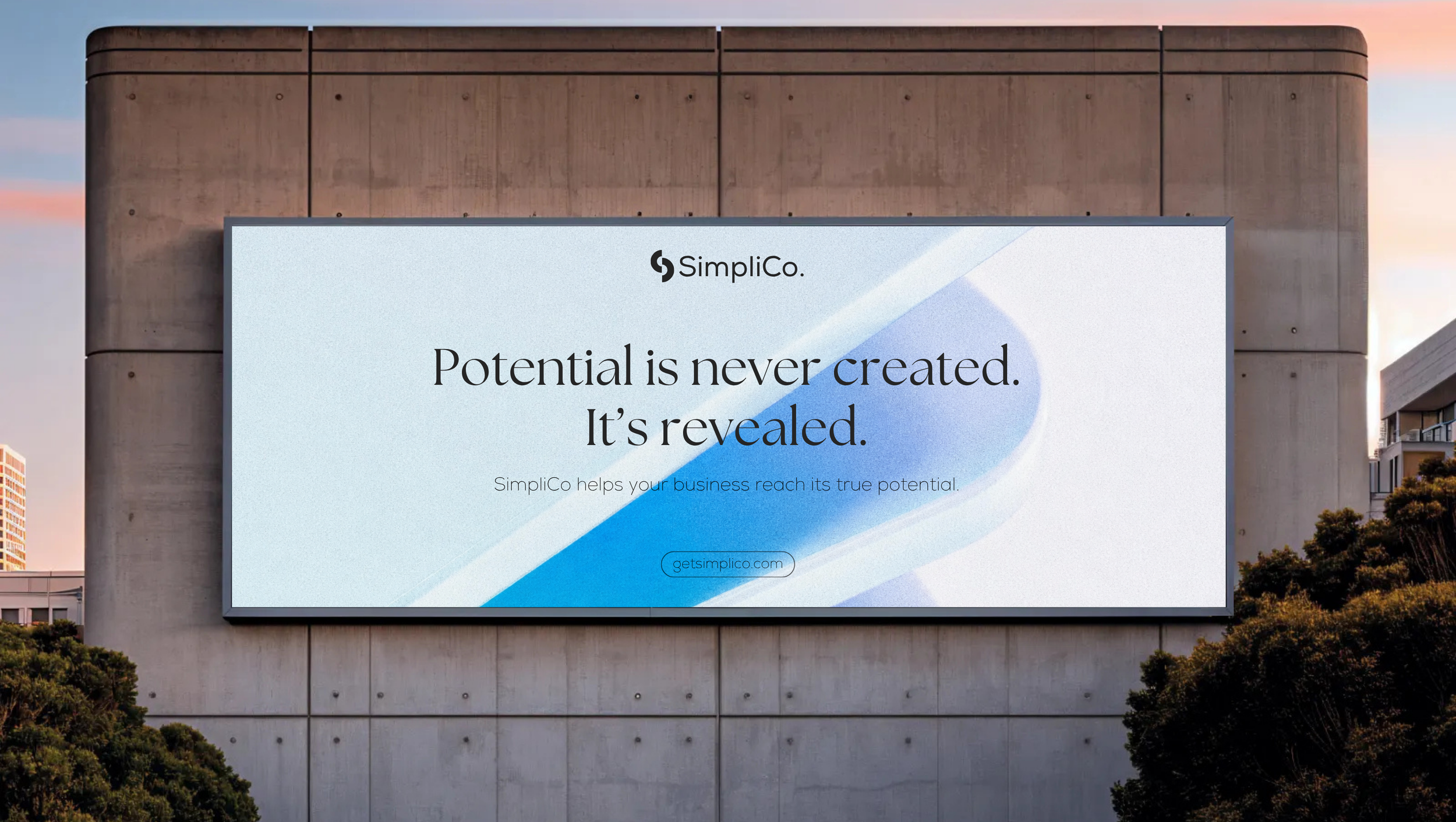
SimpliCo is built on a single belief that potential is never created, it's revealed. Behind the scenes, that means AI agents and automation doing the processing work. In front of a client, it means a real conversation first, a consultation with someone who listens before anything is built. My task was to name, position, and visually define a company that could hold both of those truths at once, and give it a category and positioning entirely its own, with ‘Business Optimization‘.
Challenge
Human, Not Just Tech.
The hardest part wasn't inventing a new category, it was making that category feel human. SimpliCo runs on smart technology, but it doesn't lead with it. Every relationship starts with a person listening and understanding, not a system processing. The brand had to carry both sides at once: capable enough to be trusted with growth and performance, human enough to never feel like a company run by machines. Lean too far toward tech, and it loses the warmth that makes clients trust it with something as personal as their business. Lean too far toward human, and it loses the credibility of what it can actually deliver.
Insights
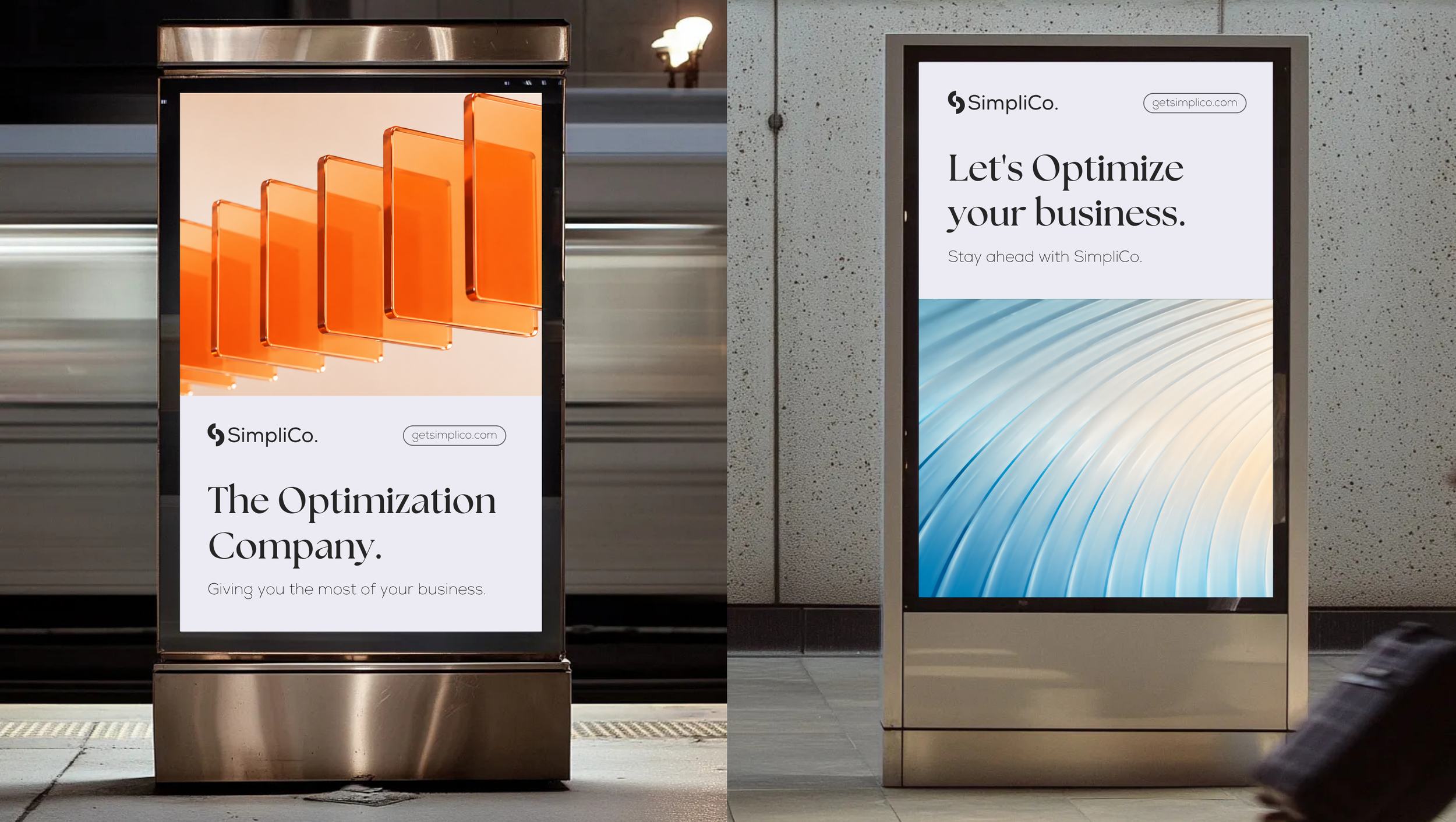
The Shape of Clarity.
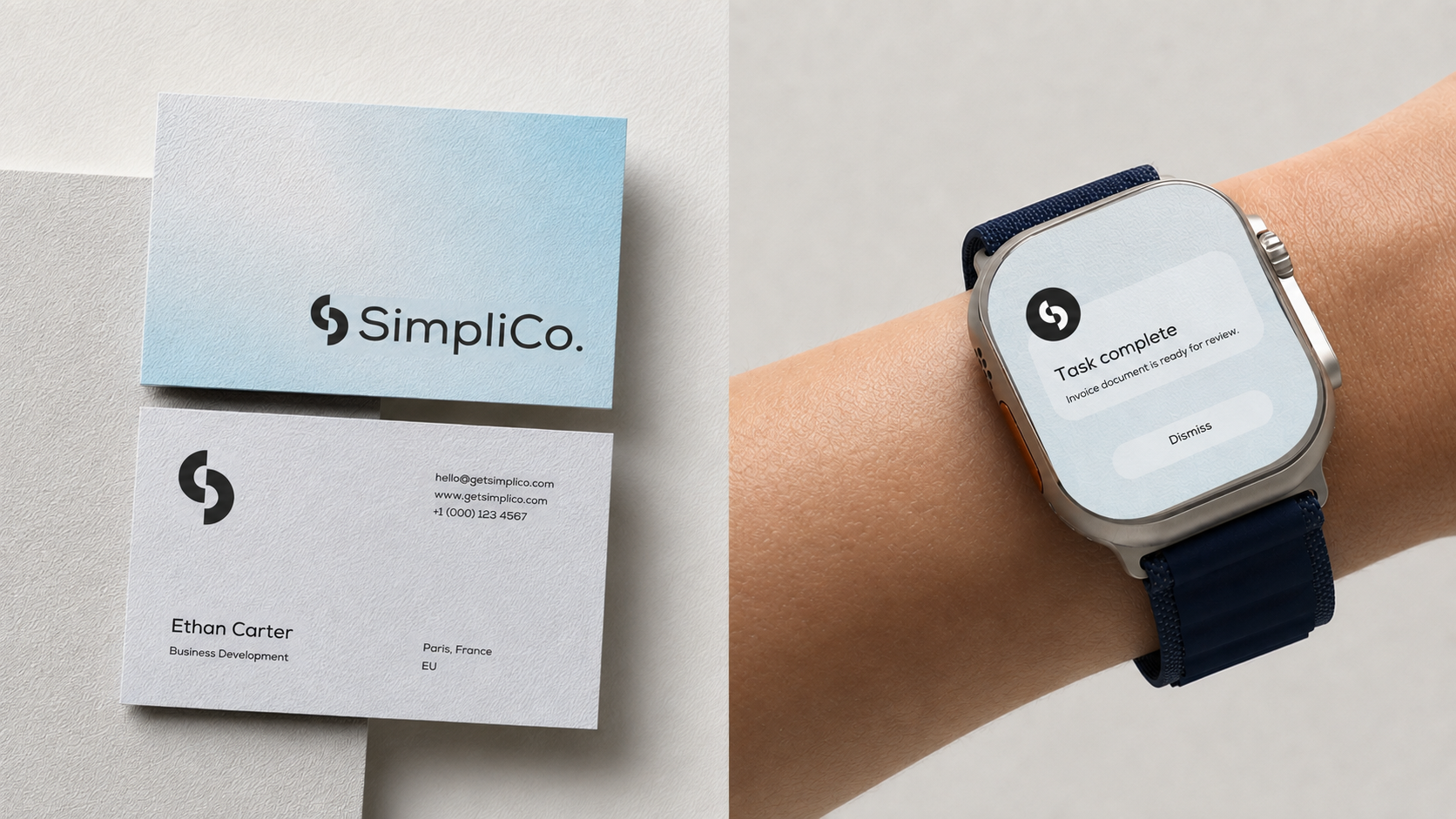
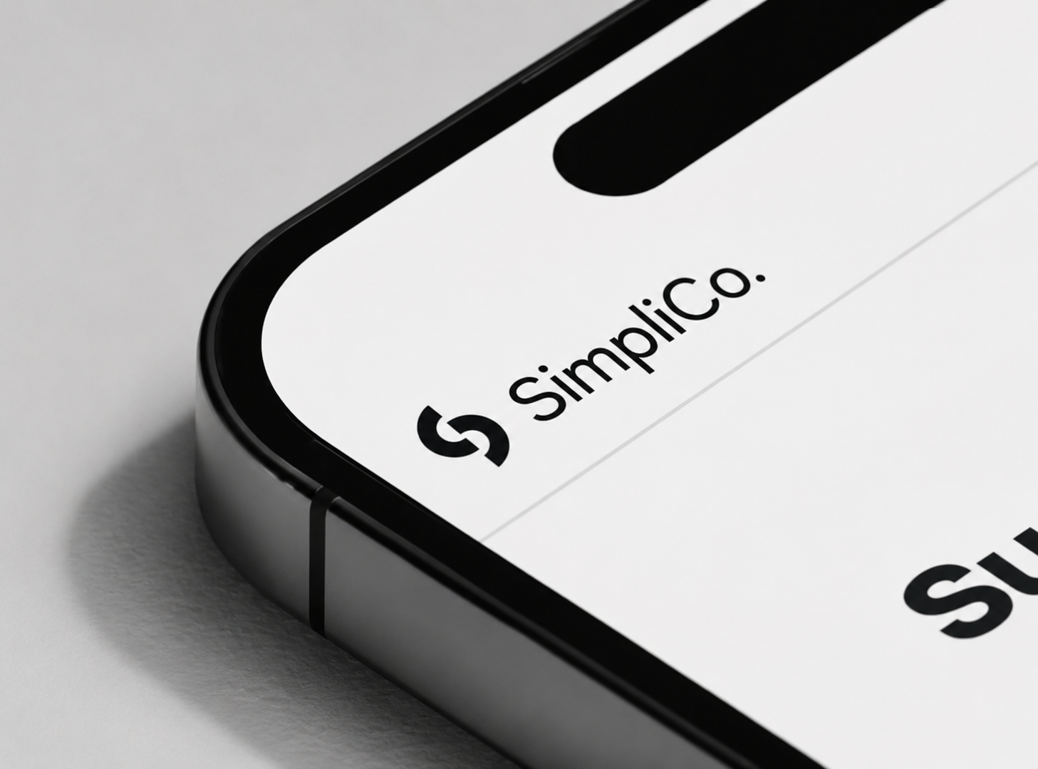
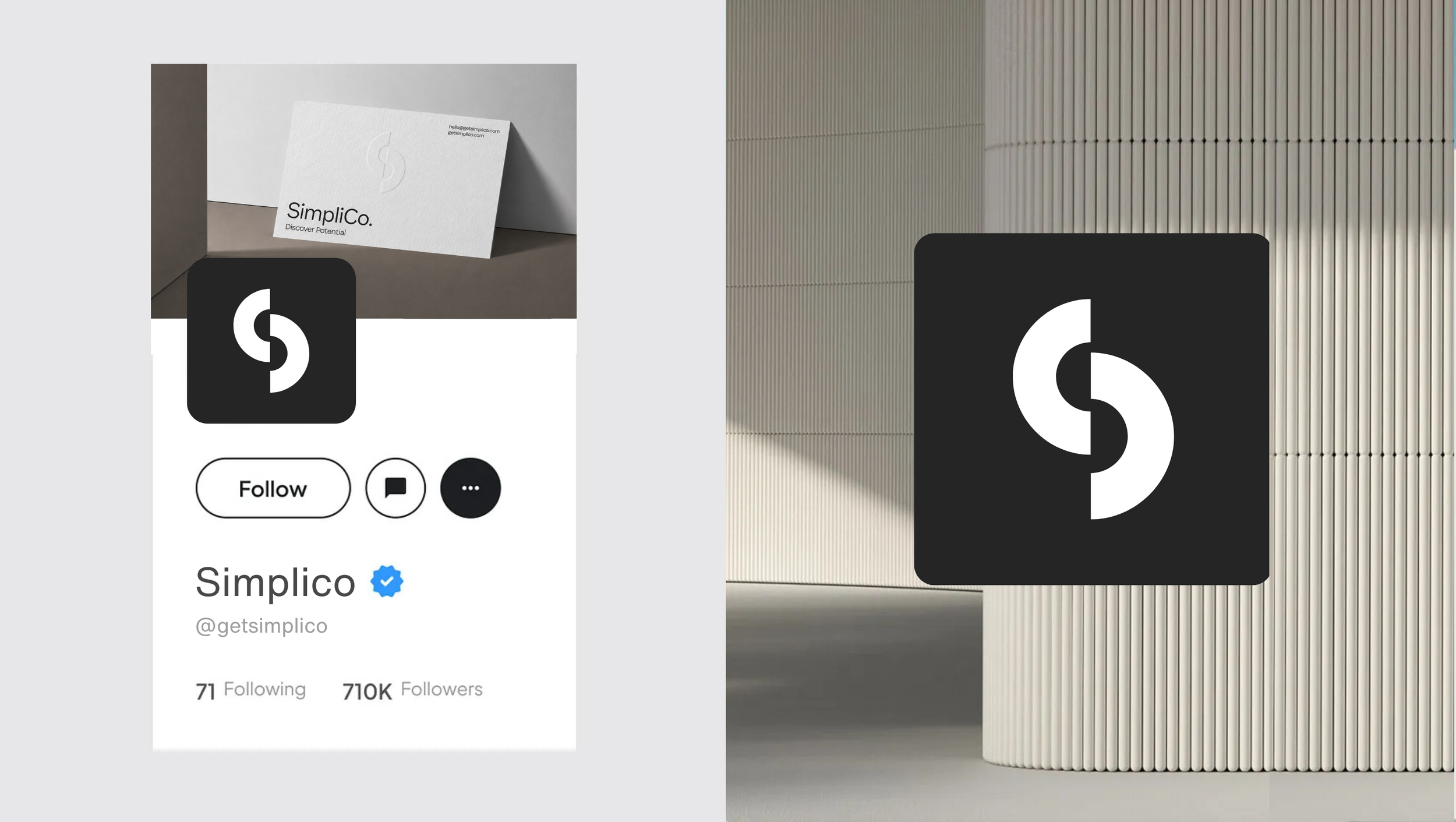
Everything about the identity had to resolve that tension, not hide it. The logomark is two interlocking forms making up a single S, each half revealing the other, the same idea the whole brand is built on. It holds up at any size, from a full lockup down to an app icon, which mattered given how much of SimpliCo's day to day life happens on a screen.
The colour system does similar work: warm cream and black carry the human, considered side, while a single sharp orange signals momentum and drive. Photography follows the same rule, real people in real conversation, set against clean, precise graphic elements. Even the name carries the tension deliberately: SimpliCo, with the period kept, reads as complete and continuing at once. Two lines carry the positioning: "A Business Clarity Practice" describes what it does, "Discover Potential" describes what it's for.

Outcome
A System Built to Grow.
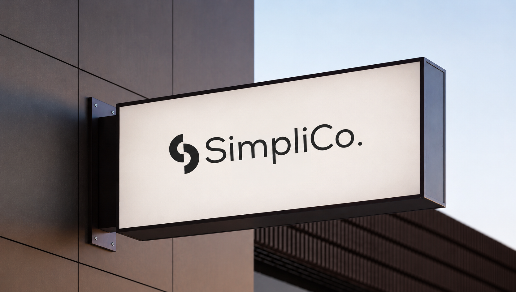
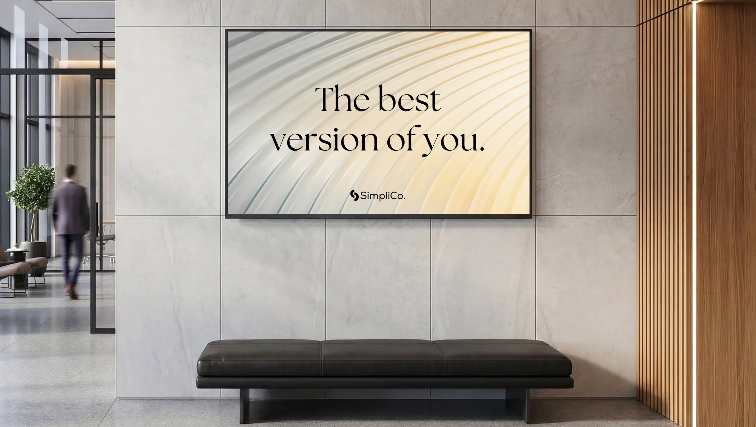
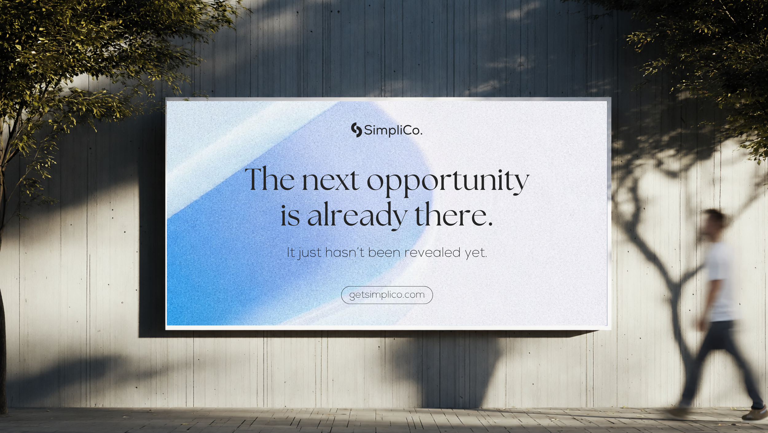
The result is an identity that can stretch across everything SimpliCo needs it to, a consultation, an app icon, a proposal document, a website, without ever splitting into two different feeling brands. It reads as considered rather than corporate, and human rather than generic, giving a genuinely new category, Business Optimization, a look and voice specific enough that no one else could claim it.
&More Work.

Marble
Linguistic Branding
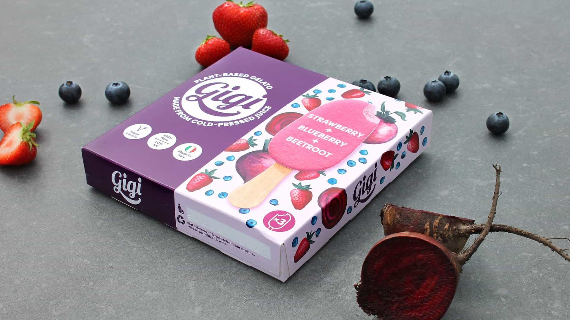
Gigi Gelato
Crafting Happiness

This Page
Building Brand Duality
Want to know more? Let’s Connect.
Feel free to contact me if you’re interested in working together or if you have any general questions.